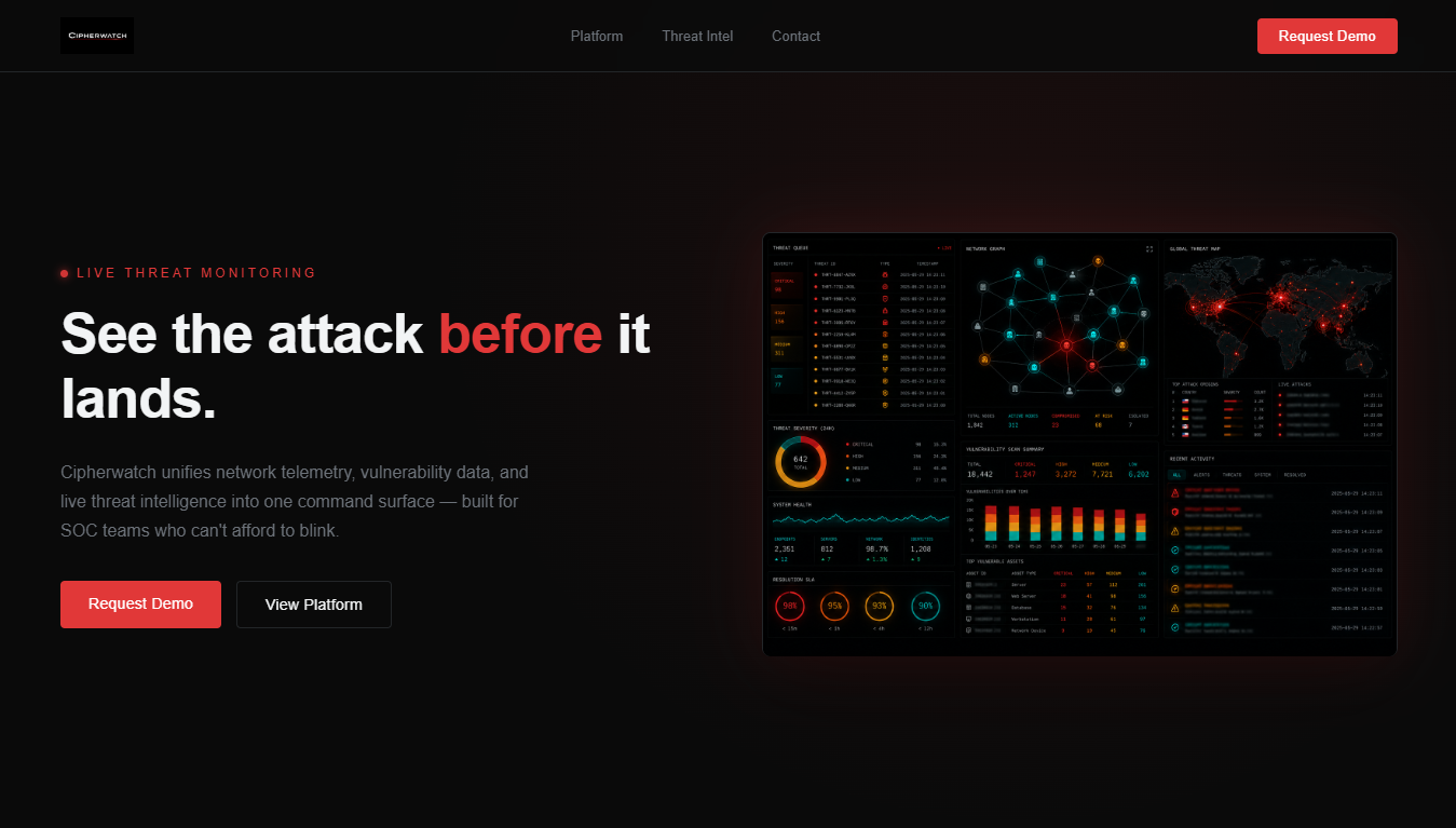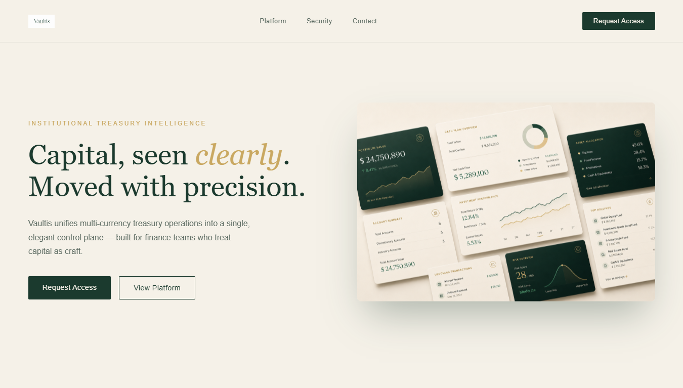
I design digital products the way an architect designs a building — structure first, restraint always, and not a single ornament that doesn't earn its place.
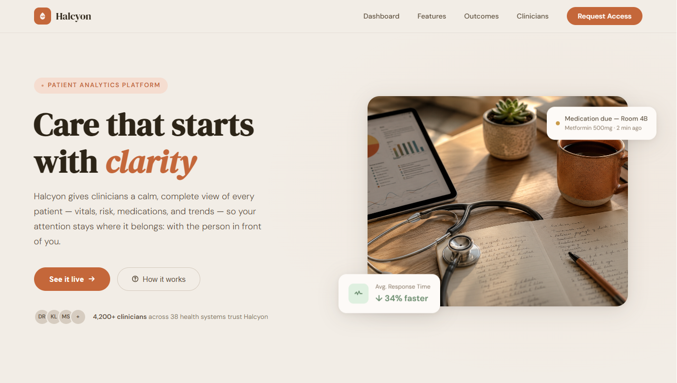
Each engagement starts from the same question — what does this audience actually need to trust this product? — and ends somewhere completely different.
The palette, the type, the tone — none of it is reused between projects. Each product gets a visual language built for its own audience.
Understand who actually uses this, under what pressure, and what they're afraid of getting wrong.
Choose a palette and type system the category doesn't expect — and commit to it fully.
Build the interface like architecture: hierarchy, restraint, and weight where it matters.
Remove anything that doesn't earn its place. Premium is mostly what you leave out.